
The latest///
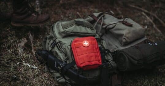
Podcast #983: Grid-Down Medicine — A Guide for When Help Is NOT on the Way

Classical Music 101 — The Origins of an Illustrious Art
Podcast #982: Skills Over Pills
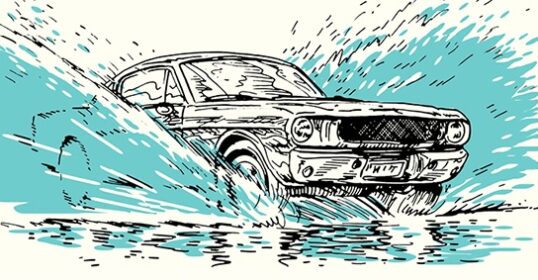
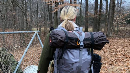
Skill of the Week: Handle a Car That’s Hydroplaning

Sunday Firesides: Gotta Get in the Reps
Odds & Ends: April 12, 2024
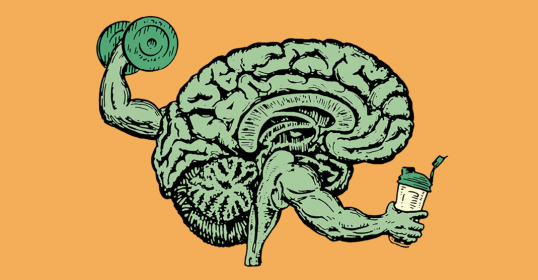
Will You Answer the Call of the New Strenuous Age?
If you've wanted to take more action in your life -- if you've wanted to strengthen yourself in body, mind, and spirit, but haven't known where to start, then The Strenuous Life is for you.

Get Character///

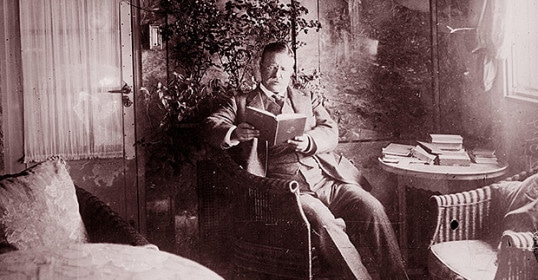
How to Live on 24 Hours a Day
Editor's note: As you look back on the year that has just past, do you feel as though you spent another 12 ...
Full article

///Get Style

The Science of Facial Hair: What Signals Do Beards, Stubble, and Mustaches Send to Others?
Wouldn't it be nice if there was a yes or no answer to every question of aesthetics? It's certainly how ...
Full article

Get Strong///

Take the Simple Test That Can Predict Your Mortality
With our archives now 3,500+ articles deep, we’ve decided to republish a classic piece each Friday to ...
Full article

///Get Skilled
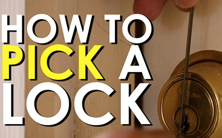
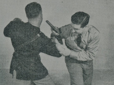
An Introduction to Lock Picking: How to Pick Pin Tumbler Locks
Some of you might be thinking, “Brett, why should I learn how to pick a lock if I don’t plan ...
Full article
Get Ahead///

Tell Me a Little About Yourself
“Tell me a little about yourself.” It’s a seemingly innocuous request -- an invitation ...
Full article


///Get Social
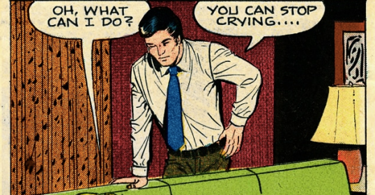
How to Comfort Someone Who’s Sad/Crying
With our archives now 3,500+ articles deep, we’ve decided to republish a classic piece each Sunday to help ...
Full article


Get Cultured///
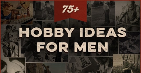
The Ultimate List of Hobbies for Men: 75+ Ideas For Your Free Time
With our archives now 3,500+ articles deep, we’ve decided to republish a classic piece each Friday to ...
Full article

///
Get action; do things; be sane; don't fritter away your time; create; act; take a place wherever you are and be somebody; get action.